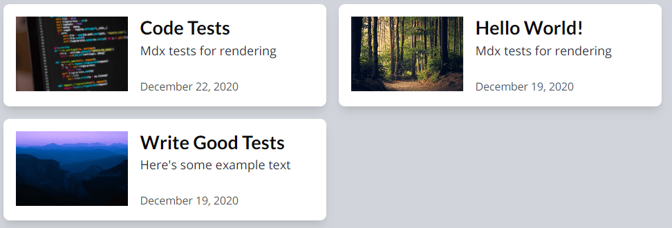
Two Column Layout on Large Screen
Initial Thoughts
I'm used to using Flexbox for everything. So, that is the road I went down. I could not seem to get what I wanted, which is this, using Tailwind CSS!

Using Flexbox made it flexible but I wanted them equal too. I thought, well flex-basis would do the trick, but I didn't see that in Tailwind. It sure looked like a grid though, so, switched to using grid!
Implementation
Created a very small styled component PostContainer to wrap up the posts.map() portion of the page.
1import tw, { styled } from 'twin.macro'2
3const PostContainer = styled.div(4 tw`5 lg:grid lg:grid-cols-2 lg:gap-x-4 lg:gap-y-2 lg:pb-46 `7)8
9<PostContainer>10 {posts.map((post) => (11 <PostCard post={post} collection={collection} />12 ))}13</PostContainer>Something tells me I'll want to extract this PostContainer to a component. I imagine using it for featured items on the main page. [Note from the future: I haven't yet!]
Issues with Grid
On the Site Dev page, there were two posts. One had a decently sized excerpt, one was basically nothing. They did not match size.
I fixed this by using h-full on the PostCard.
This caused the rows to smash into each other and there was no breathing space after the posts. I added lg:gap-y-2 lg:pb-4 on the PostContainer to fix this.
Attributions
Photo by Hisham Zayadnh (@hisham_zayadnh) on Unsplash